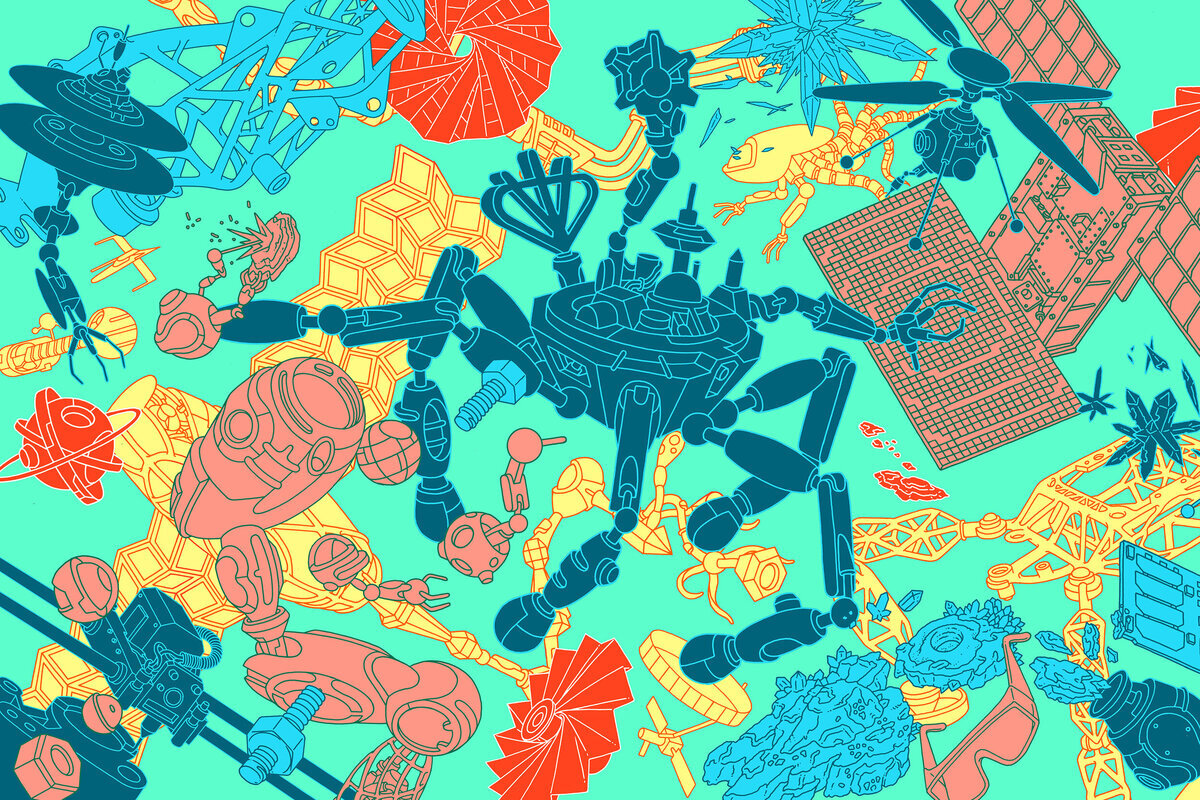


Eric Nyquist’s illustration work has always resonated with me.
When most of us start experimenting with drawing as kids, we use lines for every little thing. We doodle with lines. Lines and more lines meld together to make up a drawing. We get better, grow older. Later we add textures, color, shading, and some of us remove the line altogether in the journey.
I love a good confident, bold line when it comes to illustration.
Not that there’s anything wrong with blocks of color defining an object, but lines, man… they just hit different. Maybe because they’re part of our human code - it’s natural and innate.
It’s a tricky style though to do professionally. So many illustrators attempt it, but few, seemingly, can do it well. Whether it’s from a lack of craft or maturity, something holds it back. Somehow, some way, Eric is able to balance the analytical and technical with the natural all while often injecting just the right dash of humorous tone when it’s needed. Maybe the most important piece is that you can feel the craft, the printmaker, coming through when you see the work, even while scrolling on a retina screen.
Anyway, you likely know his work well already. He’s quite prolific, is on the covers of Jeff Vandermeer’s Southern Reach Trilogy, and you’ll often see it spread across the New York Times coveted Book Review. But, we’re super excited to share more of it with you.
Would love to know what you think and if you have a project you’re kicking around that could use some crafty lines, give me a shout.
Much love,
Aaron