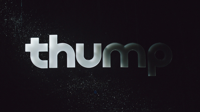


The fine peoples at the Vice electronic music label Thump hit up Mr Munkowitz to create their new bumper that goes in front of every video and piece of content from the channel. So Munkowitz called upon his favorites from the Potrero Porn Productions Crew ( Bedtimes.xxx + CallmeClark.org ) and they immediately dug into the brief, musing on how Thump and electronic music culture live in a symbiotic relationship, each reacting to the evolving impact of the other. In the treatment they focused on the juxtaposition of two sound driven worlds that evolve in reaction to one another.
As a result, three physical treatments of the logo would be shot in-camera and then edited together to create a visual rhythm between organic metal and reflective strings. In the final moment, Thump’s logo would emerge in a clean, multi-planar acrylic form, with moving light sources cascading across for the final reveal. In the end however, only two of the three setups made the cut as the fine people at Vice wanted a more homogenous aesthetic, yet the guiding principles still prevailed and informed the imagery captured in-camera.